A pie chart is a circular chart that is used to represent data in a proportional manner. The chart is divided into slices, with each slice representing a proportion of the total data. The size of each slice is proportional to the data it represents. Pie charts are commonly used to show the relative sizes of different categories or proportions in a data set. They are particularly useful when there are only a few categories, and the proportions are easily visualized. The slices of a pie chart are usually labeled with the category name and its corresponding percentage or value. Some pie charts may also have labels for each slice indicating the absolute value or count of each category.
Effective data analysis hinges on data visualization, which is why pie charts are a popular choice for visually displaying data. R is a widely-used programming language for data analysis and visualization, and this blog will guide you through the process of creating a pie chart in R. We will cover the fundamentals of data preparation and explore the necessary functions for pie chart creation, including advanced features such as customizing colors, font sizes, and other aesthetic elements. By the end of this blog, you will have a comprehensive understanding of how to create a professional-quality pie chart in R.
Contents
Data Preparation:
Suppose we have three social media platforms and we recorded the percentage of views for each category. Here is an example of our data:
| Category | Values |
|---|---|
| 20 | |
| 35 | |
| Youtube | 45 |
Creating similar data in R
The data.frame() function in R is used to create a data frame, which is a table-like data structure that contains rows and columns of data. The data.frame() function takes one or more vectors as input, and combines them into a data frame.
We will save the above data as a CSV file and import it into R using the ‘read.csv’ function. Here’s the code to import our data:
Category <- c("Facebook", "Twitter", "Youtube")
Values <- c(20, 35, 45)

df <- data.frame(cbind(Category, Values))
df$Values <- as.numeric(df$Values)
df
# Category Values # 1 Facebook 20 # 2 Twitter 35 # 3 Youtube 45
Creating the Pie Chart
The pie() function in R is used to create a pie chart. The basic syntax of the pie() function is:
pie(x, labels = NULL, col = NULL, main = NULL)where:
x:a vector of non-negative values representing the areas of the pie sliceslabels:a vector of character strings providing labels for each slice (optional)col:a vector of colors for the slices (optional)main:a character string providing a main title for the chart (optional)
Here’s an example of creating a basic pie chart using the pie() function.
pie(df$Values, labels = df$Category)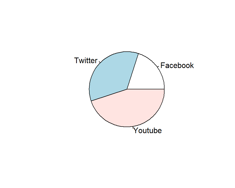
The pie() function takes two arguments: the first argument is the vector of values that represent the sizes of the different categories of the pie chart, and the second argument is a vector of labels that represent the names of the categories.
Customizing the Pie Chart
Set colors manually
By default, R will create a pie chart with random colors and minimal customization. However, we can customize the chart by changing the colors, font sizes, and other aesthetic elements.
We can change the colors of the chart using the ‘col’ argument. Here’s an example of how to set the colors to red, green, and blue:
pie(df$Values,
    labels = df$Category,
    col = c("orange", "magenta", "cornflowerblue"))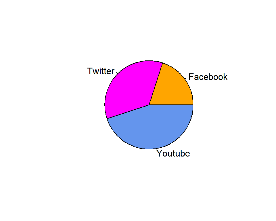
Adding title to the chart
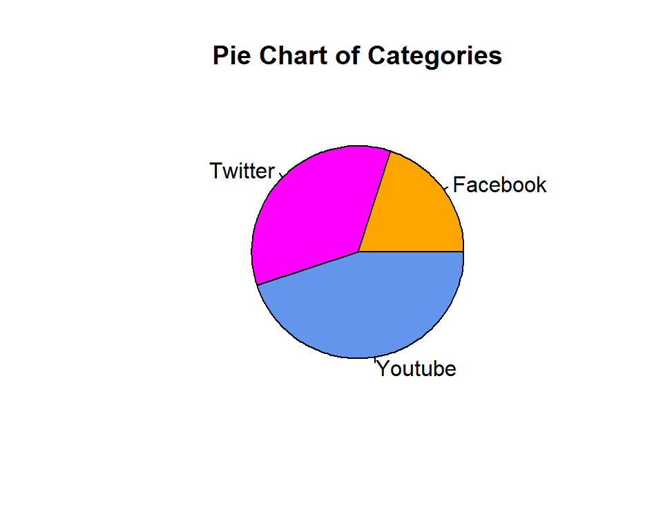
We can also add a title to the chart using the main argument. Here’s an example of how to add a title to the chart:
pie(
          df$Values,
          labels = df$Category,
          col = c("orange", "magenta", "cornflowerblue"),
          main = "Pie Chart of Categories"
)
Changing text size
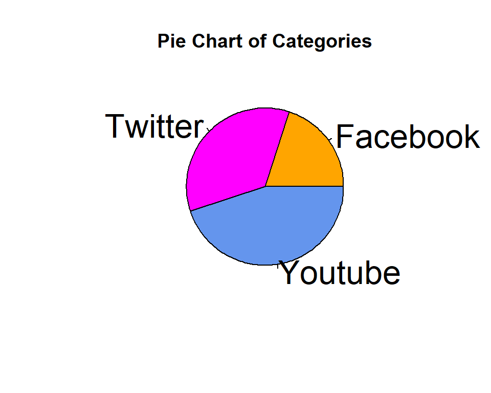
Finally, we can control the display properties of the chart using the cex argument. The cex argument controls the size of the text. Here’s an example of how to set the font size to 2.
pie(
          df$Values,
          labels = df$Category,
          col = c("orange", "magenta", "cornflowerblue"),
          main = "Pie Chart of Categories",
          cex = 2
)
Displaying values in pie chart
I have not seen any easiest way to display values on pie chart in graphics package. So, here I have displayed these values using the text() function where you need to supply coordinate values to display each text value.
pie(
          df$Values,
          labels = df$Category,
          col = c("orange", "magenta", "cornflowerblue"),
          main = "Pie Chart of Categories",
          cex = 2
)
text(0.35, 0.3, paste0(df$Values[1], "%"), col = "white")
text(-0.25, 0.3, paste0(df$Values[2], "%"), col = "white")
text(0, -0.3, paste0(df$Values[3], "%"), col = "white")
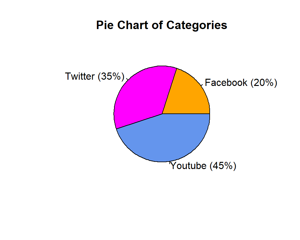
Or another simple way to show the values is to use both categories and values in the labels argument. But in this way, we cannot display the values inside each segment or slice of the pie chart.
Summarization
In conclusion, creating a pie chart in R is a simple, yet effective way of visualizing data. By following the steps mentioned in this blog, you can create a pie chart that is customized to your specifications. Remember to prepare your data properly, use the pie() function to create the chart, and customize the chart using various aesthetic elements. With these steps, you can create pie charts that are both informative and visually appealing.
Download R program — Click_here
Download R studio — Click_here

