Today, we’re going to create a hexagon plot and a scatter plot to explore the relationship between age and net income. Hexagon plots, also known as `hexbin` plots or hexagonal binning plots, are a type of data visualization used in statistics and data analysis. They are particularly useful when dealing with large datasets or continuous variables where individual data points may overlap, making it challenging to interpret patterns.
We will generate a hexagon plot using both the hexbin package and ggplot2 package.
So, let’s get started!
Contents
- 1 Cleaning workspace
- 2 Load the necessary packages
- 3 Downloading data set
- 4 Importing and exploring the data set
- 5 Observing Age and Net Income variables
- 6 Creating a new data frame
- 7 Mask the components of the data
- 8 Scatter plot between Age and Net Income
- 9 Hexagon plot Between Age and Net Income using hexbin package
- 10 Create a hexagon plot using ggplot2 package
- 11 Conclusion
Cleaning workspace
First, we’re going to clean up our workspace by closing any open graphics windows and clearing all variables. This ensures we’re starting with a clean slate.
Load the necessary packages
Next, we’re going to load up some necessary packages. These include `haven` for data import, `hexbin` and `ggplot2` for plotting, and `dplyr` for data manipulation.
library(haven)
library(hexbin)
library(ggplot2)
library(dplyr)
Downloading data set
Our dataset originates from the German General Social Survey (GGSS), obtainable through the following steps:
- Visit the provided URL (https://www.gesis.org/en/allbus).
- Scroll down and locate the
ALL BUS Cumulationlink. Click on the link to open a new window. - In the search box of the new window, type
ZA3762and press Enter. - Click on the
Research Databutton. - On the right side of the page, navigate to the
Downloadssection. - Click on
Datasetsto access the available formats. - Select the desired format, such as
STATA datawith a.dtafile extension. - Ensure that you are logged in to your account.
The dataset file will then begin to download shortly.
Importing and exploring the data set
Now, let’s read in our data. We’re using a dataset stored in a .dta file. We shall use read_dta() function from haven package to import the data.
data <- read_dta("ZA3762_v2-0-0.dta/ZA3762_v2-0-0.dta")First, we’re checking how many rows and columns we have in our dataset using the dim() function. The dataset has 2946 rows and 899 columns.
# Check the structure of the imported data
dim(data)
## [1] 2946 899
Then, we’re listing the names of all the columns in our dataset using the names() function. The column names range from “v1” to “v899” and contain various variables or attributes of the data. Here we just printed the first 50 names.
names(data)[1:50]## [1] "v1" "v2" "v3" "v4" "v5" "v6" "v7" "v8" "v9" "v10" "v11" "v12" ## [13] "v13" "v14" "v15" "v16" "v17" "v18" "v19" "v20" "v21" "v22" "v23" "v24" ## [25] "v25" "v26" "v27" "v28" "v29" "v30" "v31" "v32" "v33" "v34" "v35" "v36" ## [37] "v37" "v38" "v39" "v40" "v41" "v42" "v43" "v44" "v45" "v46" "v47" "v48" ## [49] "v49" "v50"
Finally, we’re opening up a new window to view the entire dataset. This helps us get a comprehensive understanding of the structure and content of our data. We can clearly see the information for each variable under each variable name.
View(data)Observing Age and Net Income variables
We’re particularly interested in two variables: age and net income. Let’s take a closer look at these. The unique() function for age variable returns all unique values like 41, 49, 74, and so on, spanning a range of different ages.
Similarly unique() function for Net Income variable returns the all unique values for the net income of individuals and label information.
# Age
unique(data$v686)
## [1] 41 49 74 57 65 40 60 51 56 64 67 63 62 59 68 61 66 48 70 50 52 30 44 71 69 ## [26] 54 42 58 78 76 45 55 72 36 38 47 46 83 75 53 35 73 27 34 79 43 37 29
# Net Income
unique(data$v473)
## <labelled<double>[331]>: befr.: nettoeinkommen, offene abfrage ## [1] 300 800 750 1100 1300 360 1400 99997 350 700 530 420 ## [13] 4000 630 853 0 1500 2300 450 5000 3000 6000 1600 680 ## [25] 1000 600 314 520 2100 171 1700 240 150 1800 500 330 ## [37] 1020 430 99999 990 1200 780 506 550 960 650 400 3300 ## [49] 100 200 1350 2500 4500 900 2200 740 299 1050 610 2600 ## [61] 102 10000 503 250 980 880 720 160 3800 525 5500 1950 ## [73] 820 325 850 975 971 1850 760 713 920 993 2000 1250 ## [85] 840 2250 3700 1550 486 950 3500 230 170 1060 192 1760 ## [97] 440 702 378 307 570 372 2700 614 1248 60 842 584 ## [109] 371 3200 130 810 870 1112 226 220 485 320 3100 1021 ## [121] 1074 1450 860 1750 790 1900 362 510 257 723 286 890 ## [133] 225 410 1650 460 620 1218 590 1295 538 755 770 203 ## [145] 725 1041 1080 1375 685 341 1334 370 390 568 995 70 ## [157] 748 580 480 904 690 1240 306 1421 756 2400 540 712 ## [169] 425 710 270 435 505 1028 1140 682 216 825 2800 560 ## [181] 947 1150 915 2550 259 973 625 4100 343 342 40 141 ## [193] 624 732 445 340 930 528 1903 1535 382 1064 11000 730 ## [205] 1170 2900 1280 389 1480 2085 385 7500 1622 190 1065 98 ## [217] 2350 670 1610 803 3600 490 898 280 326 90 923 478 ## [229] 1540 1580 1640 812 377 317 585 205 473 1460 1210 660 ## [241] 728 1888 439 1930 1340 1220 983 470 1057 186 1840 1390 ## [253] 426 242 260 1372 632 775 721 583 1470 1030 405 112 ## [265] 573 348 266 815 1727 1526 832 608 438 1510 1025 623 ## [277] 739 332 875 4400 7000 1017 601 970 180 101 631 1360 ## [289] 1486 3450 1120 1980 8000 646 336 1145 1003 2540 423 2750 ## [301] 935 545 4600 1034 125 762 1270 612 1130 1625 1860 135 ## [313] 213 245 1232 311 436 2573 1490 665 472 1469 392 310 ## [325] 265 562 633 1780 132 2007 602 ## ## Labels: ## value label ## 0 kein einkommen ## 99997 verweigert ## 99999 keine angabe
Creating a new data frame
Next, we’re going to create a new data frame with only these two variables.
We will create a new data frame called new_data containing only the “Age” and “Net Income” variables from the data set we imported earlier. We did this by selecting columns v473 and v686 from the original data frame, grouping the data by these two variables, and then filtering out any rows where the “Net Income” is less than 10000, excluding potentially invalid observations from the analysis.
# Create a new data frame with only Age and Net Income variables
new_data <- data %>%
  select(v473, v686) %>%
  group_by(v473, v686) %>%
  # exclude invalid observations
  filter(v473 < 10000)

colnames(new_data) <- c("netincome", "ages")
Now that we have our new data frame, let’s take a peek at the first few rows to make sure everything looks good. For this we shall use the head() function to print the first six rows of the data set.
head(new_data)## # A tibble: 6 × 2 ## # Groups: netincome, ages [6] ## netincome ages ## <dbl+lbl> <dbl> ## 1 300 41 ## 2 800 49 ## 3 750 49 ## 4 1100 49 ## 5 1300 74 ## 6 360 74
Mask the components of the data
We will mask the variable names using attache() function. Doing this will not need to specify data while using variable names.
attach(new_data)Scatter plot between Age and Net Income
Now let’s create a scatter plot. This will give us a visual representation of the relationship between age and net income. We will utilize the plot() function, setting age on the x-axis and net income on the y-axis. The title will be defined using the main argument, while the x and y-axis labels will be specified using the x-lab and y-lab arguments, respectively. Additionally, we will set the point size in the scatter plot using the cex argument, which is set to 1.
plot(x = ages, y = netincome,
     xaxt = "n",
     main = "Scatter plot between Age and Net Income",
     xlab = "Age",
     ylab = "Net Income",
     cex = 1)
axis(1, at = c(20, 30, 40, 50, 60, 70, 80, 90))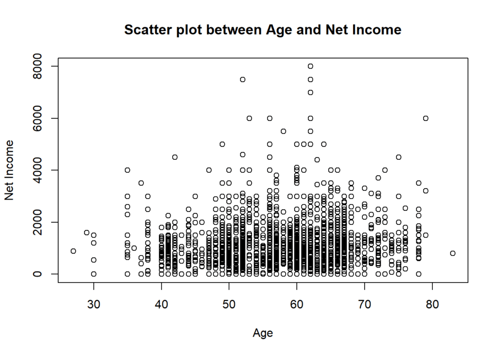
Hexagon plot Between Age and Net Income using hexbin package
Next, we’re going to create a hexagon plot. This type of plot is great for visualizing the density of observations. Darker hexagons indicate a higher number of observations in that area. We used hexbin package to visualize the relationship between age and net income. The plot is set to display net income on the y-axis and age on the x-axis, with a color scale style. Additionally, the plot includes borders, has an aspect ratio of 1, and uses a square root transformation for the x-axis values.
hexbinplot(netincome ~ ages,
           style = "colorscale",
           xlab = "Age",
           ylab = "Net Income",
           main = "Hexagon plot between Age and Net Income \n(hexbin package)",
           border = TRUE,
           aspect = 1,
           trans = sqrt,
           inv = function(ages) ages ^ 2)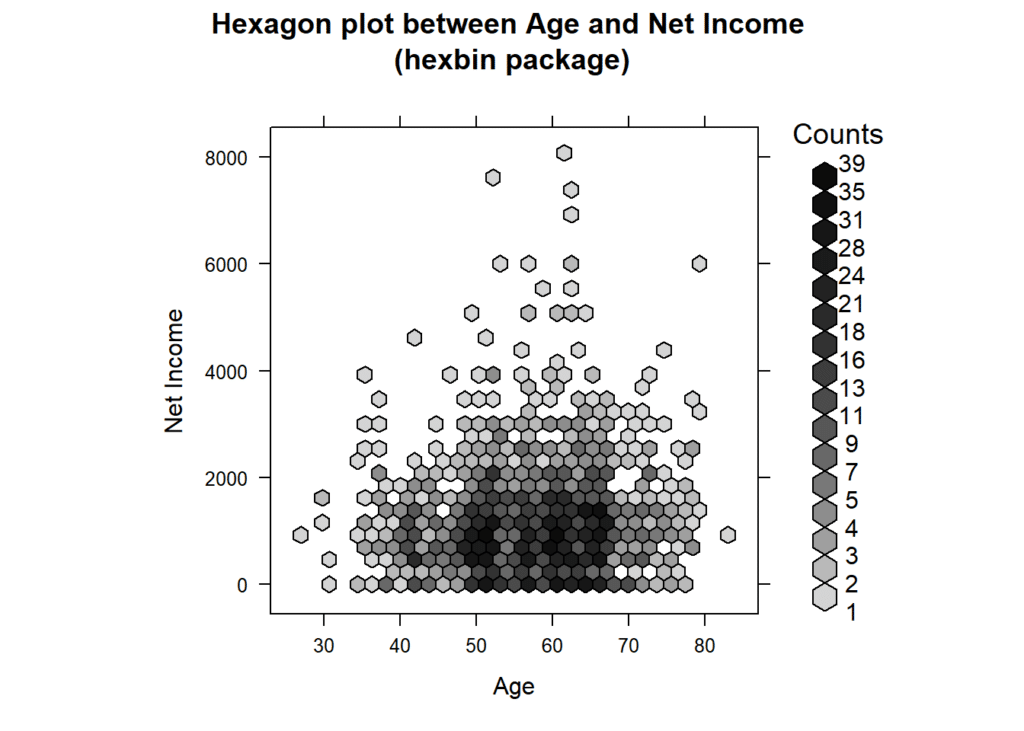
Create a hexagon plot using ggplot2 package
Finally, we’re going to create another hexagon plot, but this time we’re using the `ggplot2` packages.
- We start by specifying our data frame (new_data) and mapping the x-axis to ages and the y-axis to net income using the
aes()function. - Next, we add hexagon-shaped bins to the plot using
geom_hex()function, with 20 bins and a black outline color. - To add color to the plot, we use
scale_fill_gradient()to create a gradient ranging from light green to dark green based on the density of data points. - For the x-axis, we apply a square root transformation using
scale_x_continuous()to better display the data distribution. - We then set the labels for the x and y axes, as well as the title and subtitle of the plot using the
labs()function. - Finally, we apply a black and white theme to the plot using
theme_bw()for a clean and simple visual presentation.
ggplot(new_data,
       aes(x = ages,
           y = netincome)) +
  geom_hex(bins = 20,
           color = "black") +
  scale_fill_gradient(low = "lightgreen",
                      high = "darkgreen") +
  scale_x_continuous(trans = "sqrt") +  # Square root transformation for x-axis
  labs(x = "Age",
       y = "Net Income",
       title = "Hexagon Plot between Age and Net Income",
       subtitle = "ggplot2 package") +
  theme_bw()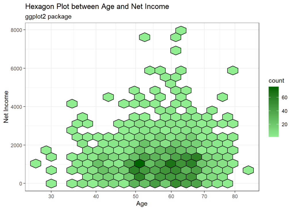
Looking at these plots one can see that almost all individuals have a net monthly income of less than 2,000 EUR. Only few individuals earn more than 6,000 EUR per month. Interestingly, the highest net income recorded is 8000, which is for an individual who is 62 years old.
Conclusion
Our exploration of hexagon plots and scatter plots in the context of age and net income unveils a tapestry of insights. From understanding data distributions to spotting outliers and trends, these visualizations serve as invaluable tools in data analysis.
As we bid adieu to this tutorial, remember that data visualization is not just about charts and graphs—it’s about storytelling. Each plot, each data point narrates a story waiting to be deciphered.
👉 For more details and informative videos 📺, you can also subscribe to our YouTube Channel AGRON Info Tech.
Download R program and R studio —
Click_here

